Which country is trying to illegally access my server via SSH!
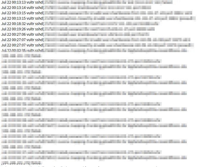
Hello, I'm Incompetent. I'm publicly exposing my Vultr FreeBSD server, and I was curious about who exactly is trying to attempt SSH connections, so I'm looking into it. By the way, in the case of FreeBSD, it delivers a "security run output" to my domain, informing me of any attempts.
 Like this. So, let's use geoip to peek at which countries' global IP addresses these people attempting connections are from. By the way, the
 geoiplookup command can be installed as follows:
sudo pacman -S geoip
This is the command:
$ geoiplookup IP_address
GeoIP Country Edition: RU, Russian Federation
Text Formatting with Bash
First, let's bring the original "security run output" string to my ThinkPad (any way is fine) and then format it.
cat vultr | grep -oP "from.*port" | awk '{print $(NF-1)}' | sort | uniq > grepip
In the above case, from the 'security run output' description named 'vultr', we extract descriptions containing 'from' up to 'port' using grep -o for matching values and -P for Perl regular expressions.
It will look something like the following string:
from IP_address port
The reason I didn't use awk at this point is that if spaces were used as delimiters, the error output would change depending on whether the password was incorrect or if the target user didn't exist on my server, so I extracted the string from 'from' to 'port' to capture everything. Next, I use awk to extract only the IP address from the last record, remove duplicate IPs with sort and uniq, and then write it to a file named grepip. Then, let's have bash perform geoiplookup on these IPs and do a quick count by country.
$ cat country.sh
#!/bin/bash

# File of IP addresses
INPUT="grepip"

# Output file
OUTPUT="countries.log"

# Initialization
> $OUTPUT

# Execute geoiplookup for each IP address and get country information
while IFS= read -r ip; do
    geoiplookup "$ip" | awk -F: '{print $2}' >> $OUTPUT
done < "$INPUT"

# Aggregate and display country information
sort $OUTPUT | uniq -c | sort -tr
Now, grant execution permission.
chmod +x ./country.sh
Just execute it now:
$ ./country.sh
      1  BE, Belgium
      1  BG, Bulgaria
      1  BR, Brazil
      1  CH, Switzerland
      1  HK, Hong Kong
      1  HU, Hungary
      1  IR, Iran, Islamic Republic of
      1  IT, Italy
      1  LT, Lithuania
      1  MT, Malta
      1  MX, Mexico
      1  MY, Malaysia
      1  NO, Norway
      1  PA, Panama
      1  PE, Peru
      1  SE, Sweden
      1  SK, Slovakia
      1  TH, Thailand
      1  TM, Turkmenistan
      1  TZ, Tanzania, United Republic of
      1  UZ, Uzbekistan
      1  ZA, South Africa
      2  RO, Romania
      2  UA, Ukraine
      3  PL, Poland
      6  GB, United Kingdom
      7  VN, Vietnam
      8  CA, Canada
      8  ID, Indonesia
      9  RU, Russian Federation
      9  SG, Singapore
     10  FR, France
     10  KR, Korea, Republic of
     11  DE, Germany
     11  NL, Netherlands
     16  CN, China
     18  IN, India
     43  US, United States
Hmm, I see...
Displaying Charts Clearly with Matplotlib
Well, it's understandable as text, but it becomes hard to read when the number is large, so we want to display it as a chart, right?
Also, if it's scripted, it can be generated as a cron job. Therefore, we will display charts using Matplotlib, a convenient Python library. Installation and code:
pip install matplotlib
cat AreYouFrom.py
#!/usr/bin/python3

import matplotlib.pyplot as plt
import collections

# Read the file and aggregate access counts by country
country_counts = collections.Counter()

with open('countries.txt', 'r') as file:
    for line in file:
        # Get country information
        country = line.strip().split(",")[1]
        country_counts[country] += 1

# Sort the data
countries, counts = zip(*country_counts.most_common())

# Create the graph
plt.figure(figsize=(10, 6))
plt.bar(countries, counts, color='skyblue')
plt.xlabel('Country')
plt.ylabel('Accesses')
plt.title('Accesses by Country')
plt.xticks(rotation=90)
plt.tight_layout()

# Output as a PNG image file
plt.savefig('accesses.png')
This allows chart output and image output.
chmod +x AreYouFrom.py
(What a filename, sounds like middle school English!)
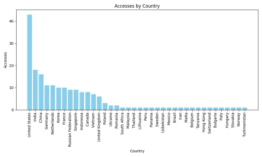
Ta-da! It seems the most attempts are from the United States.
Aggregating by Port Being Attempted for SSH
Now, let's investigate by the port being attempted for access.
With this, I was able to grep only the ports.
cat vultr | grep -oP "port [123456789].*ssh2$" | grep -oP "[123456789].* "
Output this as ports.txt.
However, since all port numbers are different, let's separate them into blocks for plot output.
$ cat AreYouPort.py
#!/usr/bin/python3
import matplotlib.pyplot as plt
from collections import Counter

# Read port numbers from file
with open('ports.txt', 'r') as file:
    ports = [int(line.strip()) for line in file]

# Calculate frequency distribution of port numbers
counter = Counter(ports)

blocks = {}
for port, count in counter.items():
    block = (port // 10000) * 10000
    if block not in blocks:
        blocks[block] = 0
    blocks[block] += count

# Create the graph
x = list(blocks.keys())
y = list(blocks.values())

plt.figure(figsize=(12, 6))
plt.bar(x, y, width=6000, color='skyblue', edgecolor='black')
plt.xlabel('Port Number')
plt.ylabel('Frequency')
plt.title('Port Numbers by Frequency')
plt.xticks(x, [f'{i}-{i+9999}' for i in x], rotation=45)
plt.grid(True, axis='y', linestyle='--', alpha=0.7)
plt.tight_layout()

# Save to PNG file
plt.savefig('port_numbers.png')
And then...
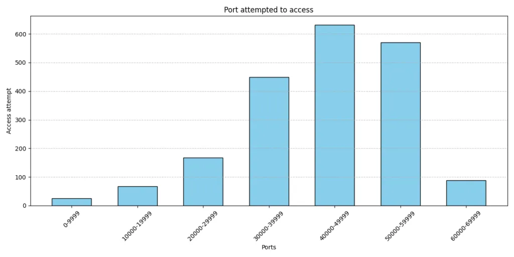
Why are there so many attempts on unlikely port numbers with values over 30,000...? Well, that's all for today. See you next time.